
Simple, bold color to tell the multi-sided story of our product on first load. CSS transforms made the diagonal effect.
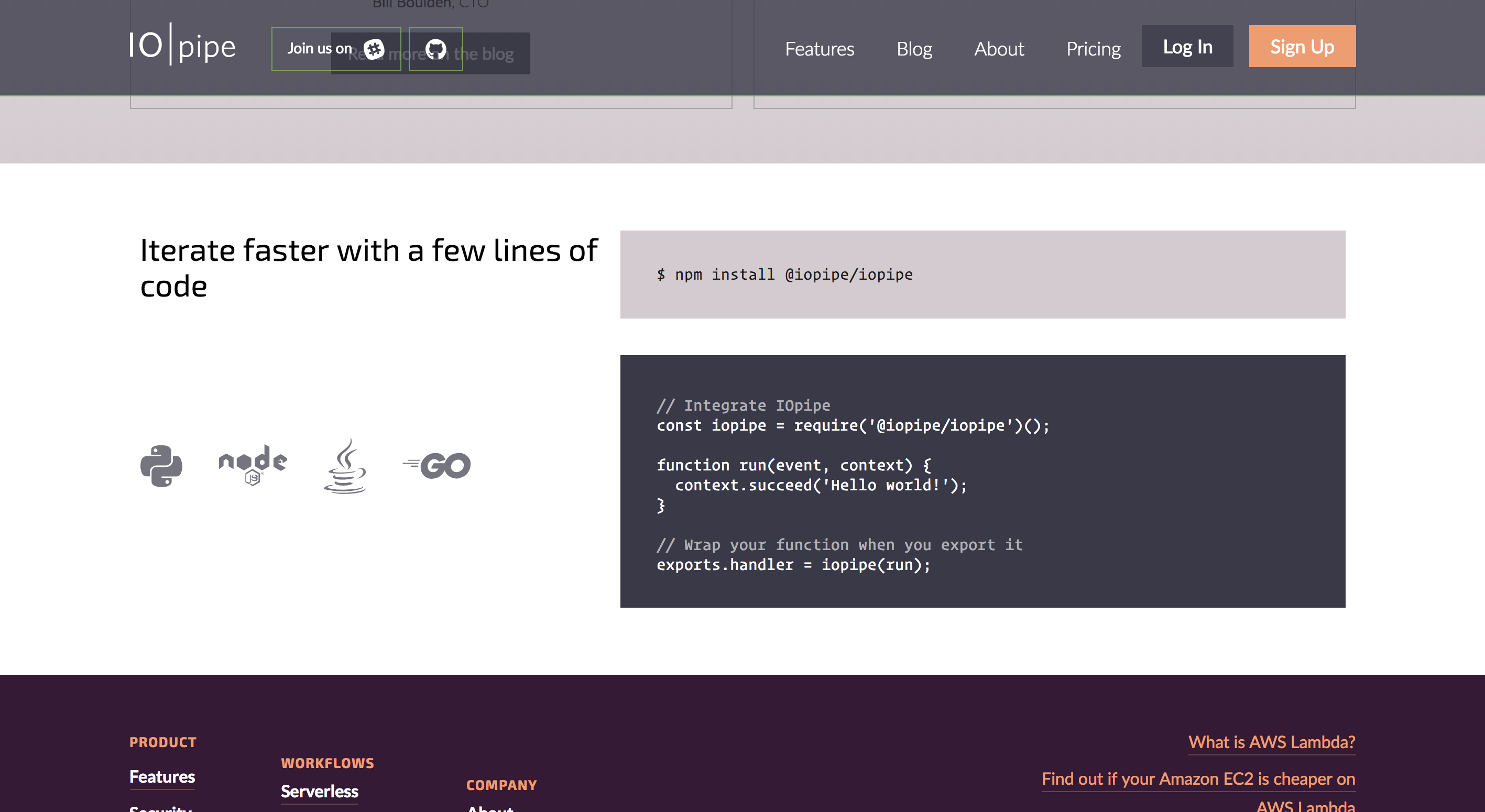
I used a combination of JSX and CSS animation to create a typing effect for the installation section. The component I created for this takes the number of characters as a prop and manages the timing based on it for easy text editing and reusability.
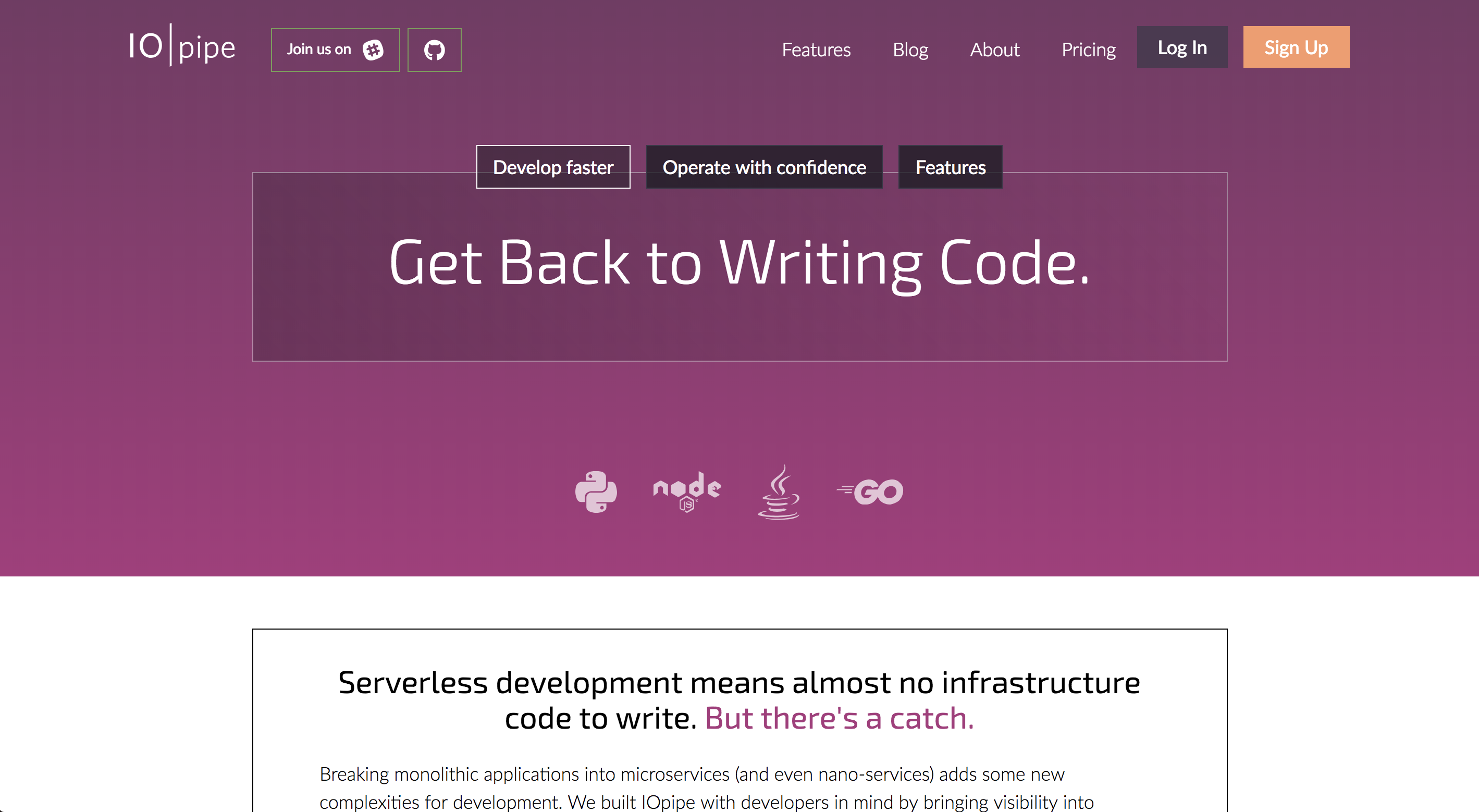
I built an internal navigation into the feature pages for easy navigation and to address sideways entry to these pages.
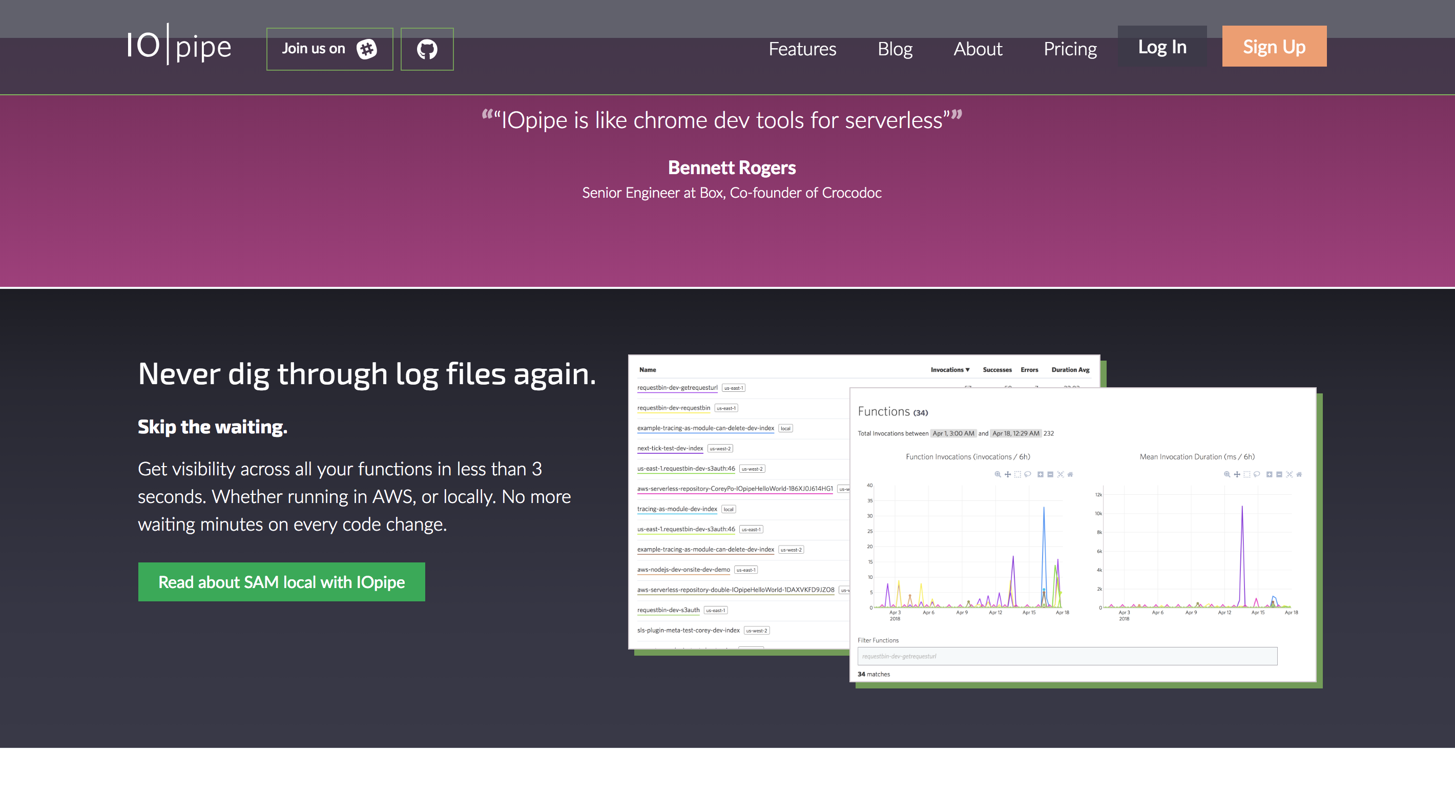
Reusable React components for displaying imagery take a simple prop to apply any of the available layout options. This made consistency and the process for new pages a snap.

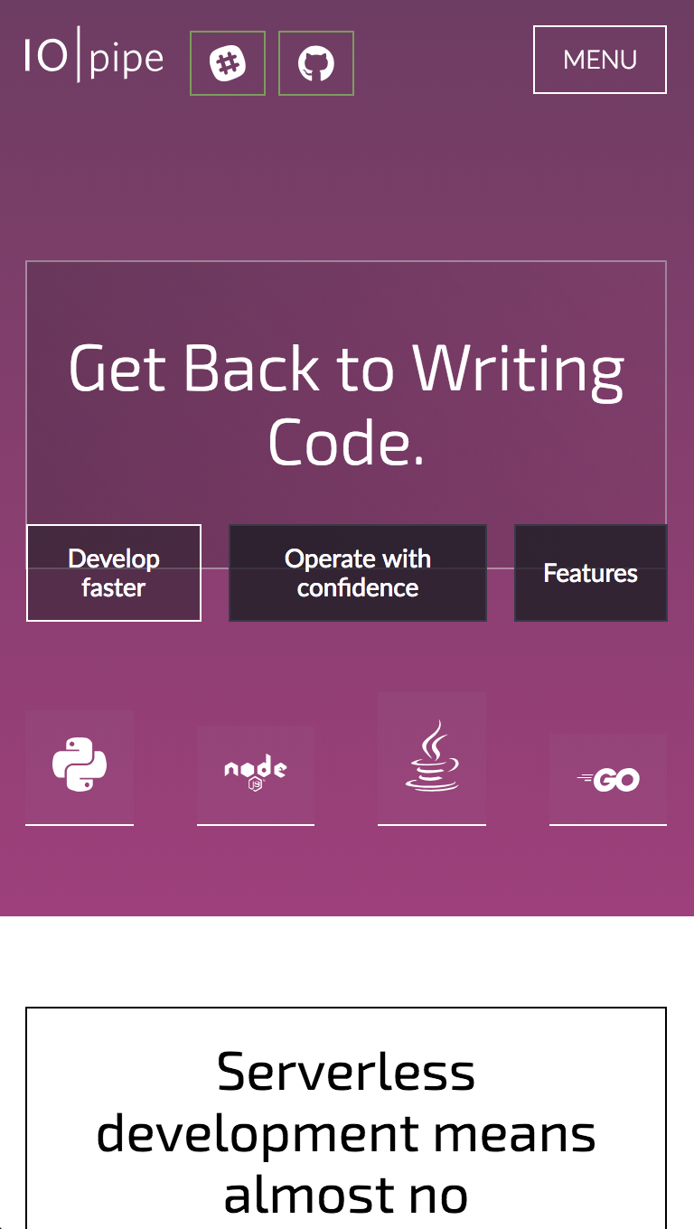
As usual, the site is fully responsive and the styling is written in a mobile-first setup.