
I created a simple, bold palette and pattern to make a micro-brand for this tool. It seemed like it would have been a missed opportunity not to use a fun CSS animation.
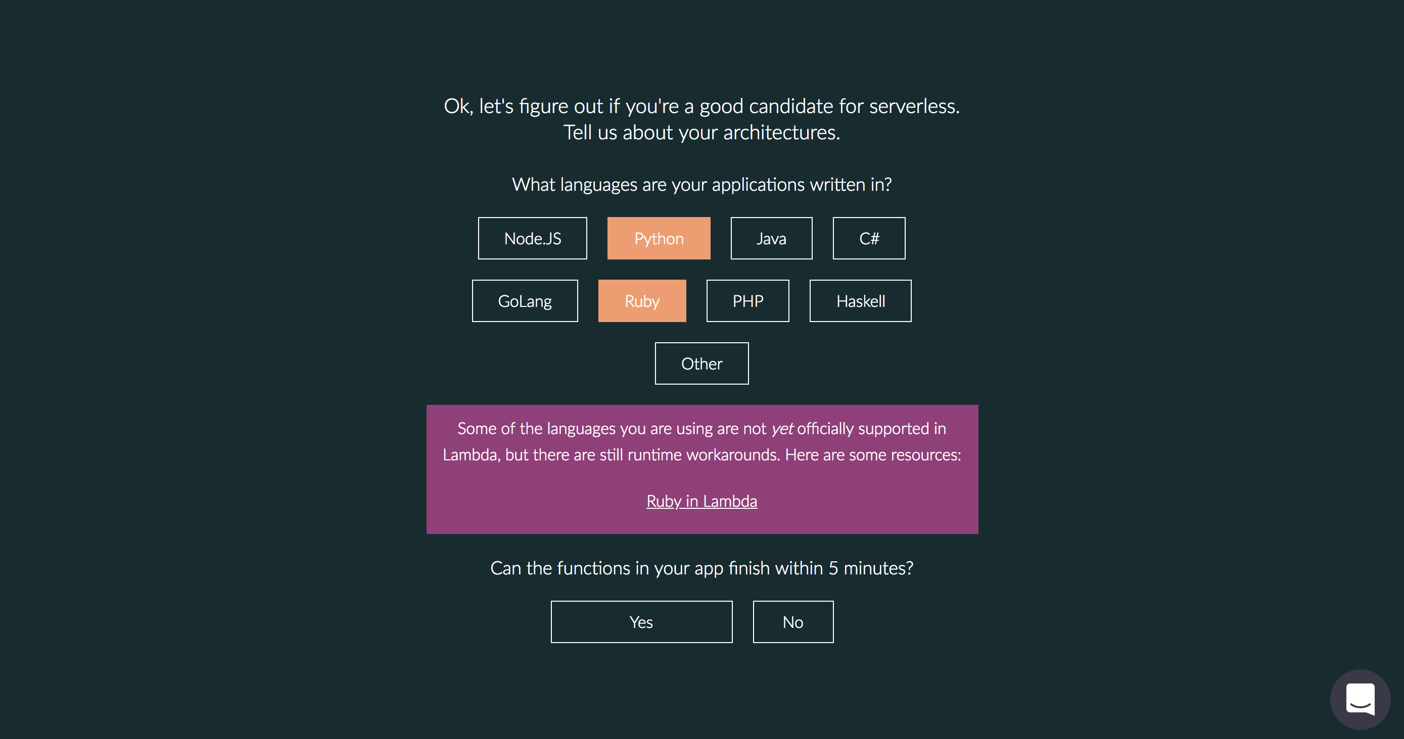
We wanted to make sure to link users to relevant resources even if their current runtime was not supported.
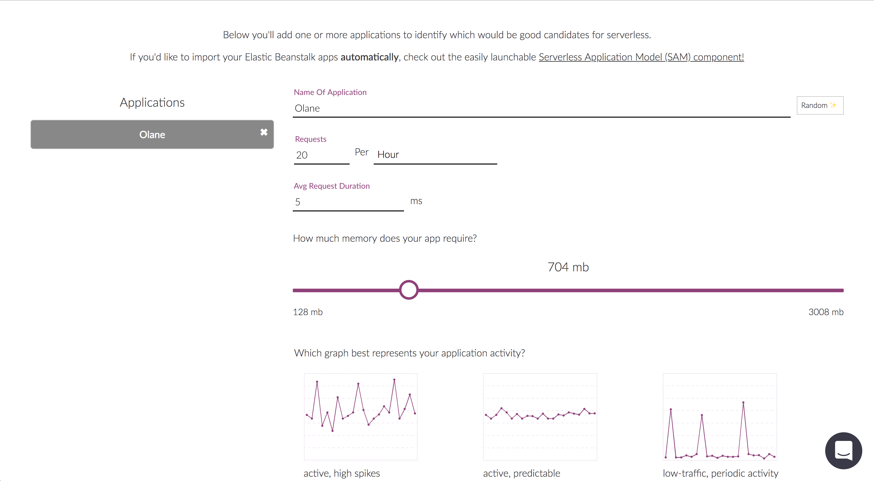
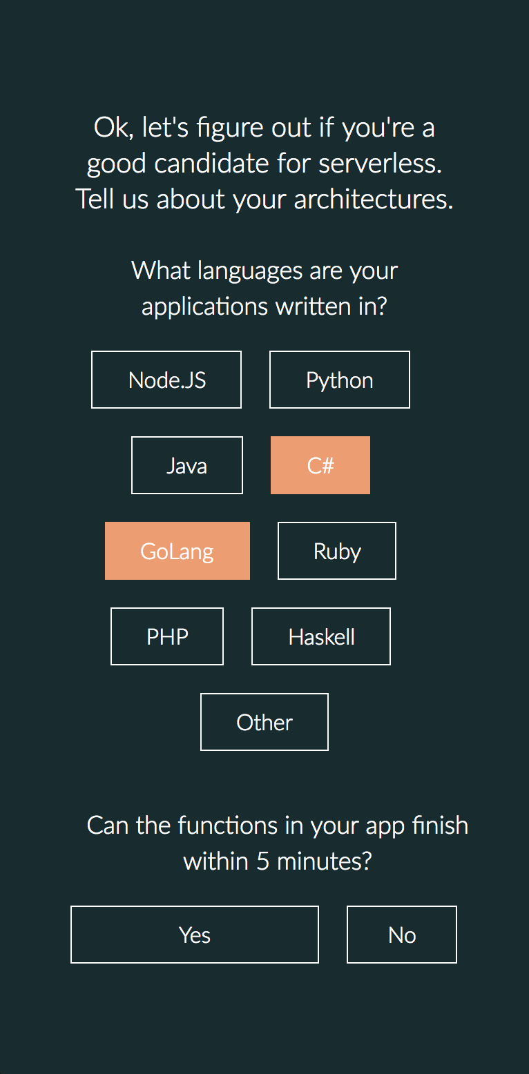
Users input as much data as they can to get an accurate picture of potential savings. They can add and remove multiple applications to build more comprehensive reports.
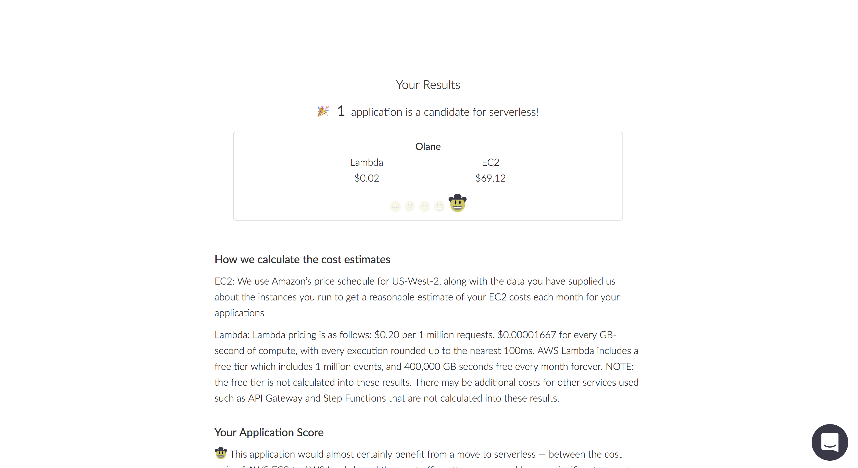
Users get a result and an explanation, but are also able to go back and update as needed.
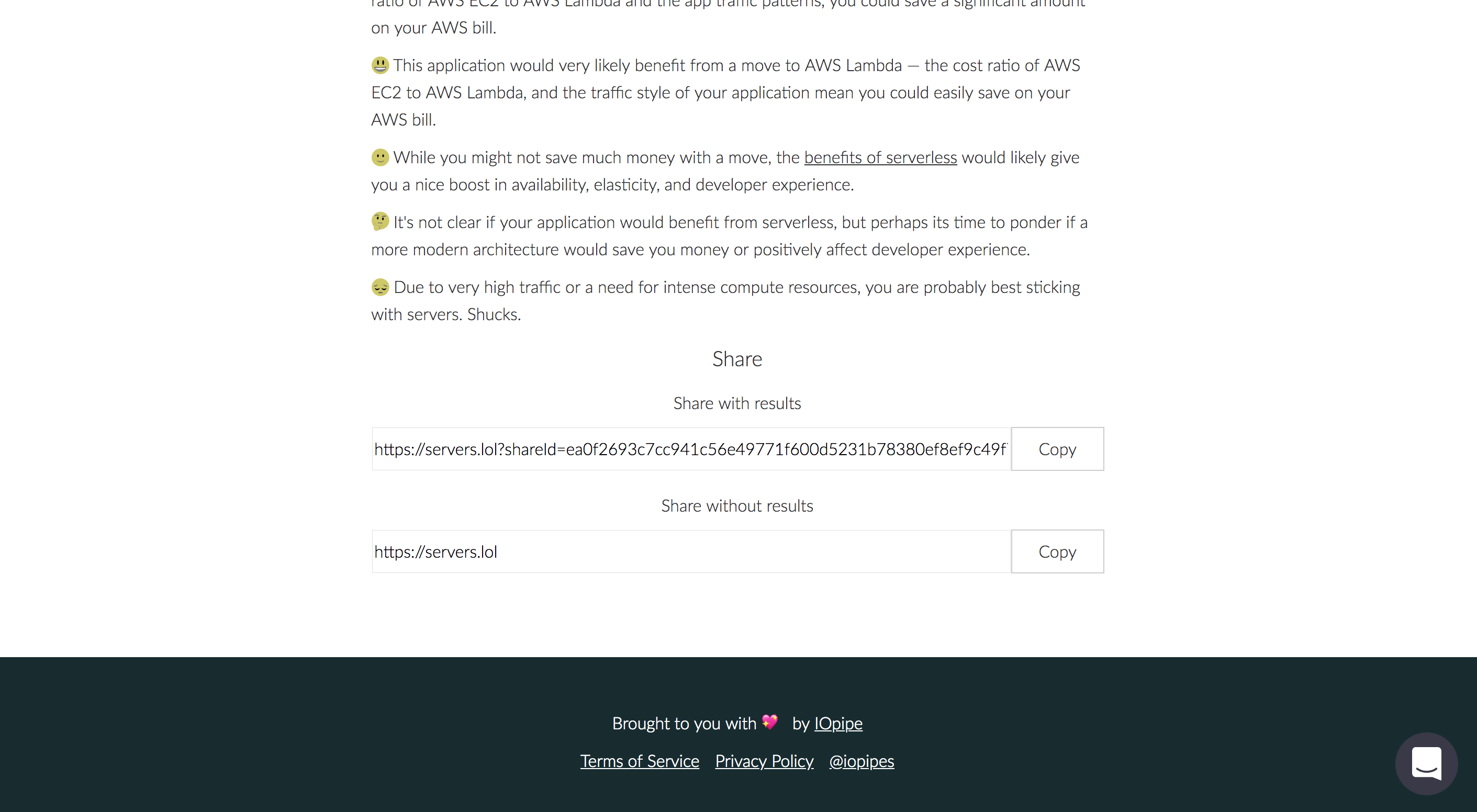
Sharing can be done as a general url, or a direct url for the specific report.

As usual, the site is fully responsive and the styling is written in a mobile-first setup.